GLLS Rebrand
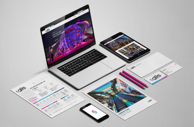

Complexity, Simplified
GLLS
Deliverables
- Strategy
- Branding
- Graphic Design
From the outset, it was clear that GLLS didn’t need to reinvent itself. Their strengths are already well established, and they have two decades of experience transforming intricate LED lighting designs into user-friendly solutions. They needed a brand pivot that could clearly express that expertise; visually, verbally, and strategically.
Through competitor research and discovery, we helped GLLS distill its mission, voice, and personality into a focused brand framework. Together, we built an identity rooted in confident simplicity and visionary thinking. This is precisely what their clients count on.
The Brand in Focus
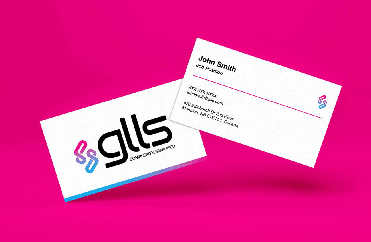
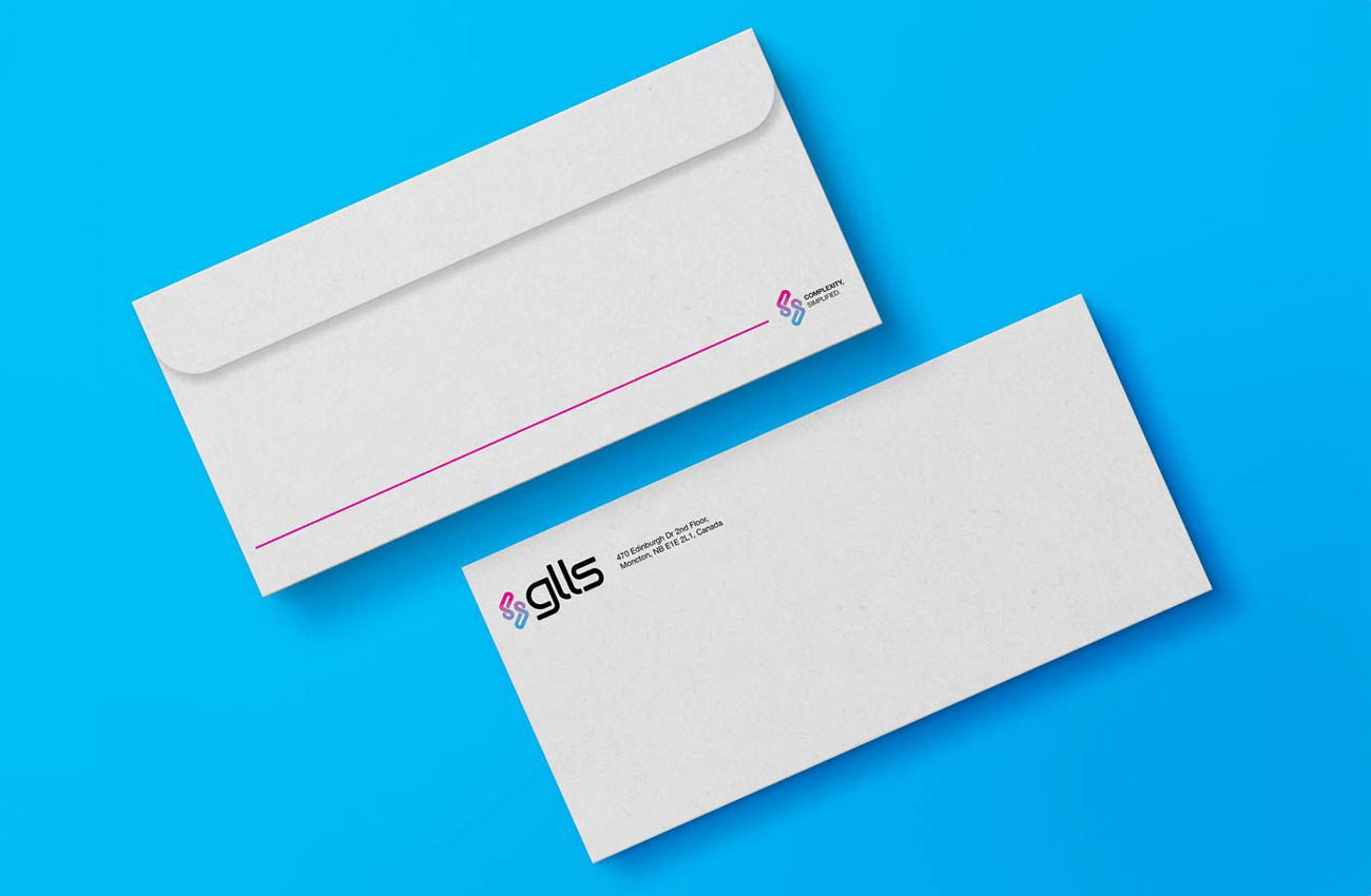
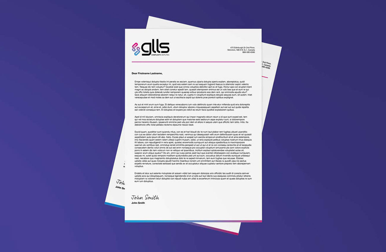
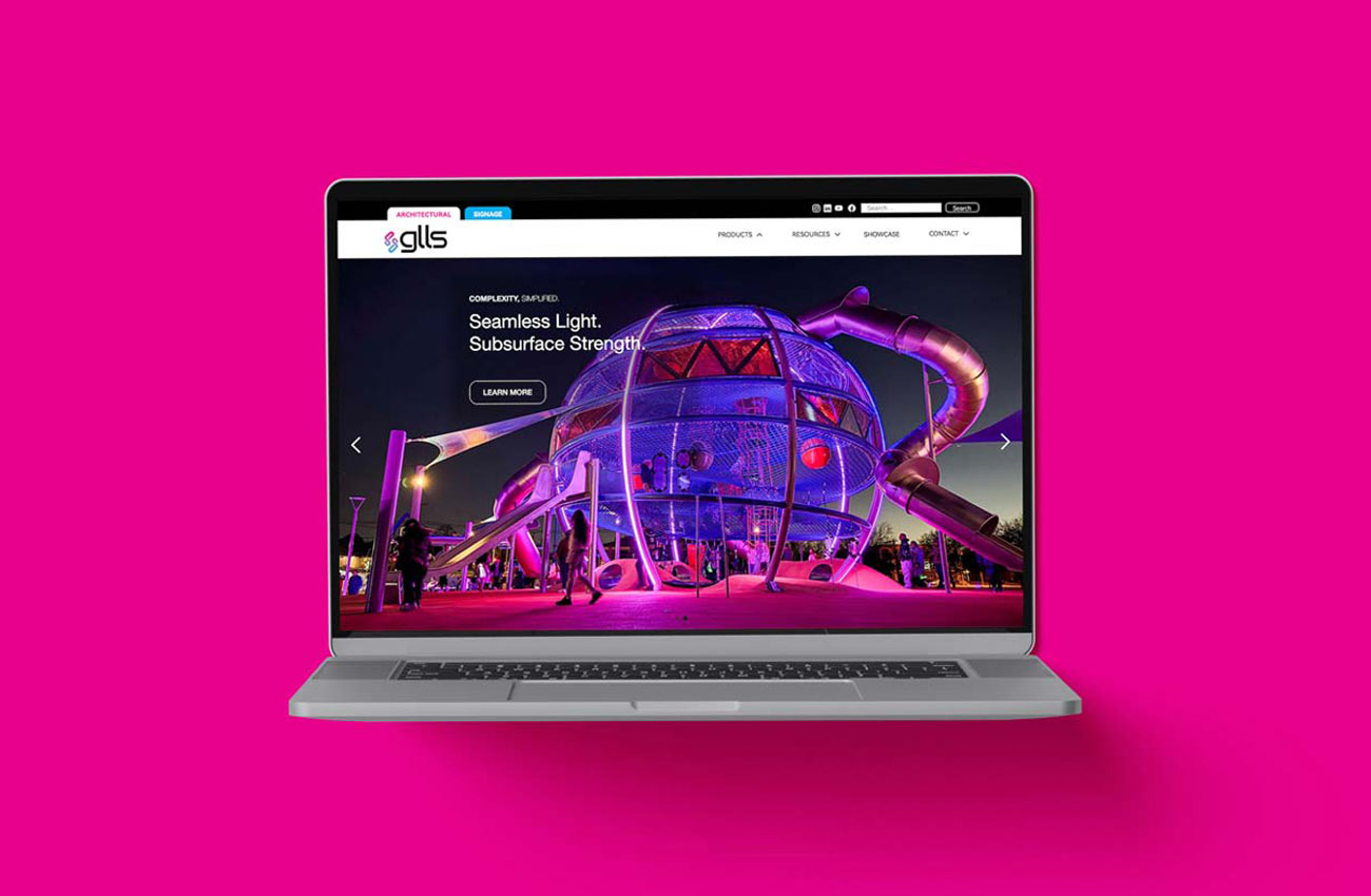
Visual Identity: The refreshed look centers on clarity and modernity, using Helvetica Neue LT Pro for headlines and body copy to express precision and approachability. The updated color palette balances boldness and trust: cyan, magenta, navy, and black, used intentionally across applications.
Verbal Identity: GLLS’s new voice is confident and clear, speaking directly to the lighting design community with clarity and purpose. At its heart is the brand’s new tagline: Complexity, Simplified. This promise captures how GLLS thinks, works, and delivers.
Core Messaging: With a new mission to be defined by bold creativity and confident simplicity, and a vision to be a trusted visionary for the lighting design community, the brand now communicates with focus, ambition, and authenticity.
The response from the GLLS team has been deeply rewarding.
“The final product is the result of thoughtful listening, strong collaboration, and a deep understanding of who we are and where we’re headed,” said Derek Breneol, Co-Founder at GLLS. “You captured the tone of GLLS beautifully… it genuinely feels like us.”
We’re proud to have helped bring this new chapter of GLLS to life. This brand simplifies complexity, leads with clarity, and sets a confident course for the future of lighting.

